
Seedream 5.5 Review

Seedream 5.5 review with portrait comparisons, smartwatch edits, room redesigns and transparent sprites, showing where its creative improvements matter.

Seedream 5.5 earns my recommendation for images that need several revisions and transparent assets reused across layouts. What matters most in this Seedream 5.5 review is continuing a design without losing what already works.
As of November 10, 2026, this review draws on my examples from my November 10 Chinese walkthrough and ByteDance's release material.
A portrait comparison with less glare
Seedream 5.5's portrait result looked more restrained than 5.0 Pro in my same-prompt comparison. I used the same 3:4 aspect ratio and 2K setting, generating one image with each model. I didn't select from a batch or edit the results.
The difference was easiest to see where light crossed the face. In the 5.5 image, the transition from cheek to neck looked smoother. Backlit hair retained finer strands. The 5.0 Pro result had harder highlights across the forehead, nose and chin, with the hair highlights blowing out into brighter patches.
I preferred the quieter treatment. A portrait doesn't become more convincing simply because every bright surface shines harder. Here, the softer transitions made the skin easier to believe.
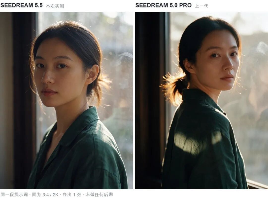
These exercises show where 5.5 made a useful difference.
| Exercise | Requested change | What I observed |
|---|---|---|
| Portrait pair | Same prompt and settings across two models | Smoother skin transitions and finer backlit hair in 5.5 |
| Smartwatch | Update numbers, then replace a chart | Casing and layout stayed visually steady |
| Room redesign | Replace shelving, move crate, change pendant | Perspective and window-light direction remained coherent |
| Flower composition | Add branches, then change a flower's material | Vase, paper texture, lettering and seals remained recognizable |
| Transparent runner | Six poses on one transparent image | A sequence sheet ready for later slicing |
The portrait shows a change in rendering taste; the editing exercises explain my preference for 5.5 on continuing work.
Three watch rounds made editing tangible
The smartwatch exercise gave Seedream 5.5 a tightly defined job: change the information inside an existing design. The initial image showed 09:41, 6,420 steps and a heart-rate graph labeled 78 BPM. The watch casing and screen layout provided a fixed visual frame.
In the second round, I changed the time to 18:30 and the step count to 12,890. I also asked for the activity rings to close. The third round replaced the heart-rate graph with a calorie bar chart showing 860 KCAL. Each new request used the previous result as its reference.
Across those three rounds, the casing and layout looked steady to me. The watch still read as the same design while its information changed.
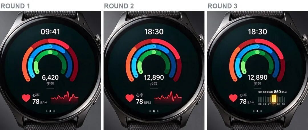
That matters for a product presentation. A morning and evening screen should look like two states of the same interface. Redrawing the hardware or rearranging icons would turn a simple update into a different design. I'd use this approach for illustrative screen variations where the surrounding object needs to remain familiar.
ByteDance's 100-edit demonstration explores the same idea over a much longer sequence. The company describes preservation of unedited regions as each output becomes the next input. My three-round watch exercise made the appeal tangible: I could revise the information without making the watch look like a different design.
A blue shelf and a lace peony
Seedream 5.5's room sequence was useful because the edits changed the scene's character without making the room feel newly invented. I replaced a dark-brown bookcase with a Klein-blue metal shelf. Then I moved a wooden crate beside the sofa, exposing the herringbone floor beneath its original position.
The exposed floor was filled in, and the window-light direction and perspective stayed coherent to my eye. Later, the pendant became a colorful Memphis-style neon-glass fixture. The room moved toward a different aesthetic while keeping a recognizable spatial structure.
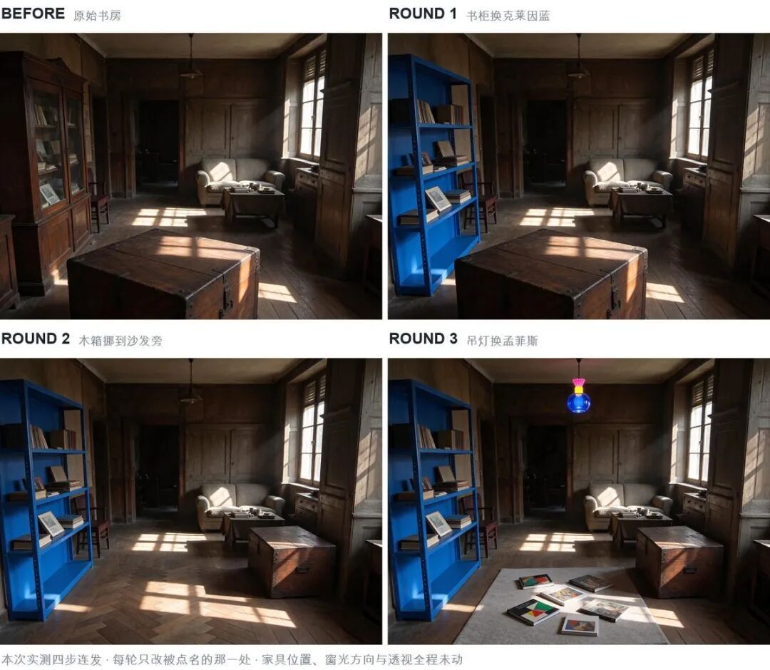
I'd choose this kind of sequence for exploring an interior's visual direction. Each change gives the next one something specific to respond to.
The flower composition pushed continuity into a less literal direction. It began with pale peonies in a porcelain vase on rice paper. I added ink plum branches and bamboo, then changed the central peony into lace and pearls. The vase, paper texture, lettering and seals appeared to carry through the sequence.
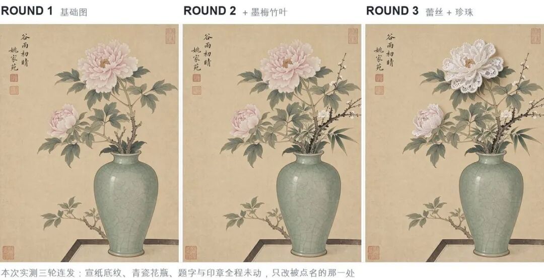
That last change is my favorite example. It asks for a material surprise inside an established visual language. Lace and pearls can become the focal point because the rest of the composition still feels familiar. I'd keep that restraint: a selective material change has more character than replacing the entire picture with a new style.
Transparent sprites need a second step
Seedream 5.5 transparent backgrounds are useful when the generated subject belongs inside another design. Its native RGBA output includes an alpha channel, which stores transparency alongside color. ByteDance describes full and partial transparency from text or reference-image inputs.
My runner exercise put six running poses on one transparent image, arranged from left to right. The character wore a yellow raincoat and red boots. The brief called for a consistent appearance across the sequence, giving the sheet a clear purpose beyond being a collection of illustrations.
The result was one image containing the poses and transparent space around them, rather than a finished GIF or separate editable layers. Cut the poses into individual frames after generation, then assemble them for animation or use them as sprites.
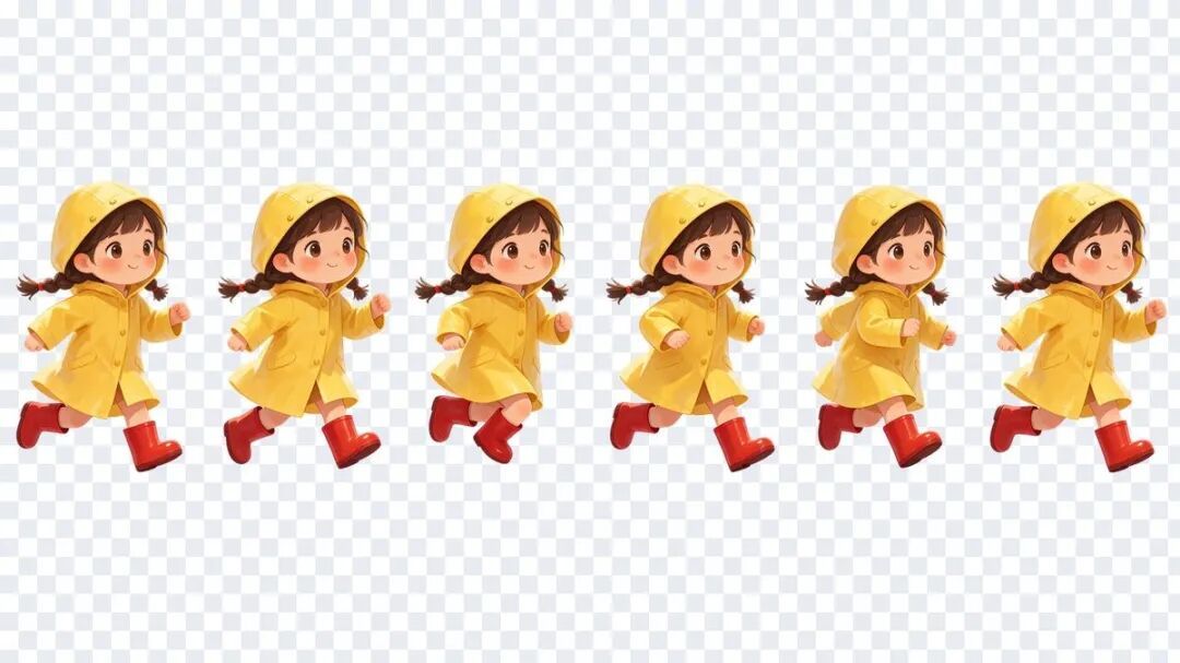
I'd take that route for a small illustrated loading character or an animation prototype. The yellow coat and red boots give the motion a simple visual anchor. The remaining work is arranging the frames and timing the movement, rather than treating the image file itself as an animation.
A snowy-owl reference exercise showed a quieter use for the same capability. I requested two circular detail windows, one for feathers and one for a claw, with transparency outside them. The result provided elements that could sit over a larger explanatory layout. The prompt also called for thin dark-gray outlines.
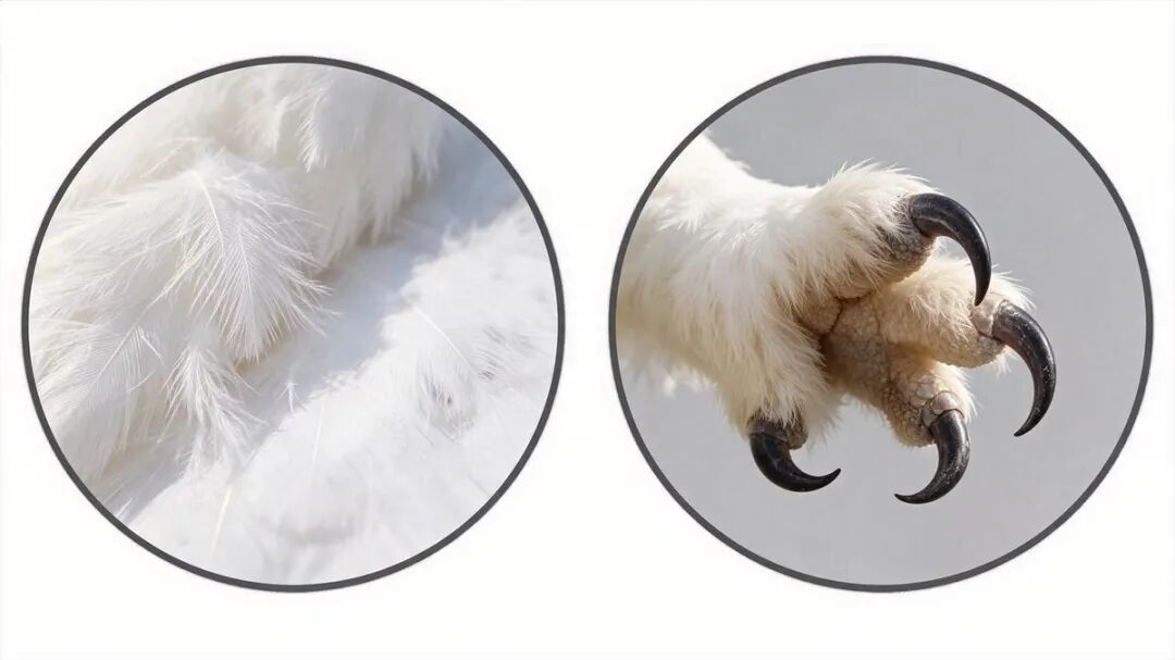
Both exercises make transparency part of the composition from the beginning. Native RGBA is my default for assets meant to be placed elsewhere, with an export that preserves alpha. The transparent area gives the image a useful boundary.
Better detail still leaves words to read
Seedream 5.5's realism improvements are most persuasive when they help a specific subject. My portrait pair made that visible through skin transitions and backlit hair. The lace-and-pearl flower used detail differently: its material change supplied the idea, rather than merely adding more texture everywhere.
ByteDance describes more natural lighting, materials and skin, including reductions in excessive gloss and overexposure. That direction fits what I preferred in the portrait. I would give controlled highlights more weight than aggressive sharpness when the goal is a believable face.
Text remains a separate judgment. ByteDance reports 0.4% severe corruption and 1.7% minor corruption in its Chinese/English dense-text evaluation. Those company figures give me reason to take the improvement seriously and keep human proofreading as the default.
A watch number and a paragraph of small Chinese annotations also ask different things of a model. The first needs a few exact values inside a familiar layout. The second needs many characters to remain legible together. Read the final words before using the image.
Where Seedream 5.5 earns its place
Seedream 5.5 is a strong choice for creative work that continues after the first image. The watch exercise gave me changing information inside a steady frame. The room and flower sequences made revision feel exploratory: a blue shelf led somewhere different from a brown bookcase, and a familiar peony became lace.
Those examples are why I'd move revision-heavy compositions and reusable transparent assets toward 5.5 first. A one-shot portrait offers a smaller reason to switch: I preferred its lighting in one direct pair, but that alone doesn't justify replacing a process already producing the look you want.
For exact packaging or logo fidelity, keep the original asset as the default and compare a representative edit against it. A visually steady watch casing doesn't prove another product's lettering will survive.
If the next request is another deliberate change to a picture you already like, choose 5.5. Native transparency adds a second reason when the result needs to travel into a larger design. Keep the final text and finishing work in human hands.
About the author
Neo James
Founder of ReelDanceNeo James is the founder of ReelDance and specializes in AI video generation products. He brings years of experience building AIGC products, with a focus on practical creative workflows.